Some might argue that the real Magic Kingdom is found on your mobile phone or even your desktop.
It's been a solid 10-years since I was bit by the Disney bug. And although I having been making websites since 1999, it was roughly 10-years ago I really started to understand the design of a good website.
Maybe it was a bit of pixie dust or maybe I was inspired by Walt, but as I learned more about the creation of Disneyland and Walt Disney World, the more I realized that the principles go hand-in-hand with quality web design.
Disneyland's Hub and Spoke
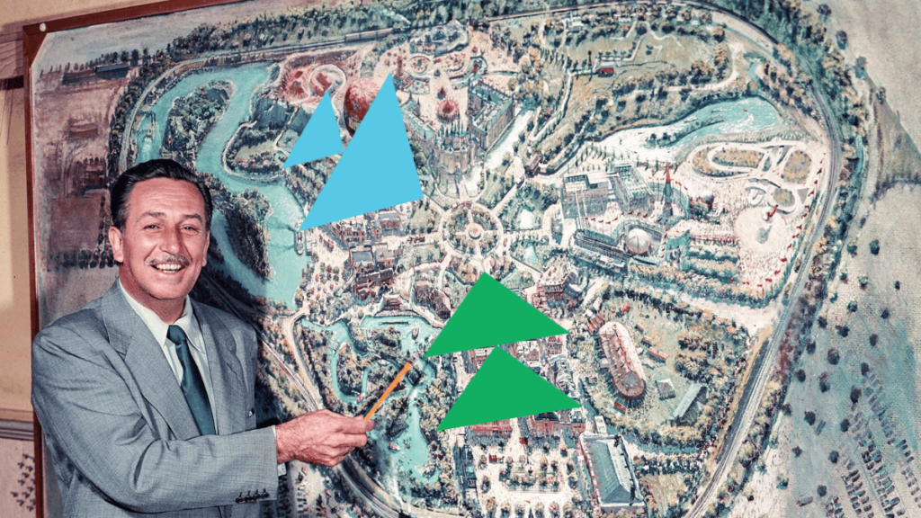
For those of you who are not aware of the hub and spoke, this is the principle Walt used when designing his first Magic Kingdom. When you walk down Main Street USA, you enter the hub. From this spot, you can see entrances for many of the other lands. Much like a bicycle wheel, this hub points to the spokes - like Fantasyland, Frontierland, Adventureland, and Tomorrowland.
There are just enough choices for you to choose your own adventure - but not too many choices for you to feel overwhelmed. These lands are clearly labeled on park maps and often have large themed signs in the entrance.
After you visit a land, you know exactly where to go so you can start a new adventure. You feel comfortable to explore and confident you can get back to where you started.
Website Navigation
This same principle can be used when it comes to designing the navigation of a website. After users scroll through the homepage, often they find themselves wanting to choose their own adventure. The navigation menu is at the top of the page and clearly labeled for the "lands" the users can enter.
Much like the Disneyland hub, we should only have a few options. When website owners try and throw everything in the navigation menu, users get confused and give up.
Don't get cute and use clever names to label the pages. Name them exactly as they are in the navigation menu and users can make it to the pages that are most important to them.
Try to limit your navigation menu to have less than seven main links - with the ideal number being around five.
Garbage Cans Every 30 Feet

Have you ever heard about there being a garbage can every 30 feet at Disney Theme Parks? Well, it's true.
Walt observed patrons walking through the park after purchasing a treat. On average, most individuals would decide to drop the trash on the ground if they had to hold it for any longer than 30-feet. And since Walt wanted to have the cleanest theme park, he made sure that there were garbage cans every 30-feet. That's also why there are over 1,000 trashcans in Disneyland.
Three-Click Rule
We know how many feet it takes for a person to drop their wrapper on the ground, but how many clicks will a user take to find what they are looking for on a website?
Well, it has the number three - but it certainly isn't 30.
In many situations, users will abandon a website if they can't find the information they are looking for within three-clicks.
For this reason, you should place the important sections and content of your website in visible - clickable locations. If the information is important for the user and it's valuable for you to have the user find it, make sure you highlight the location on your top pages.
Remember, not everyone enters your website on the homepage. Use sidebars, footers, and internal links to help drive users to pages that you really want to highlight.
Also - not everyone littered after 30-feet, but it was enough of a trend to make it noticeable. Not everyone will leave after 3 clicks, but you should make it so users can find the information they are looking for easily.
Walking Paths
You have to understand that the development of Disneyland happened over the course of 12-months. That's right - the entire theme park was built in a year. There are a ton of stories that document employees working the night before getting things in place for the opening ceremony. Because of that, there were certainly things that were put together without a ton of user research.
For example, over the course of the opening year, maintenance teams would observe that there human made walking paths through some of the flowerbeds and horticultural areas. Instead of putting up a fence, Walt insisted that they pour concrete instead. There was a reason the guests were choosing to walk that way and it would be a better user experience to give them what they wanted.
This is a great example of taking what a user is doing and making changes based on their preference.
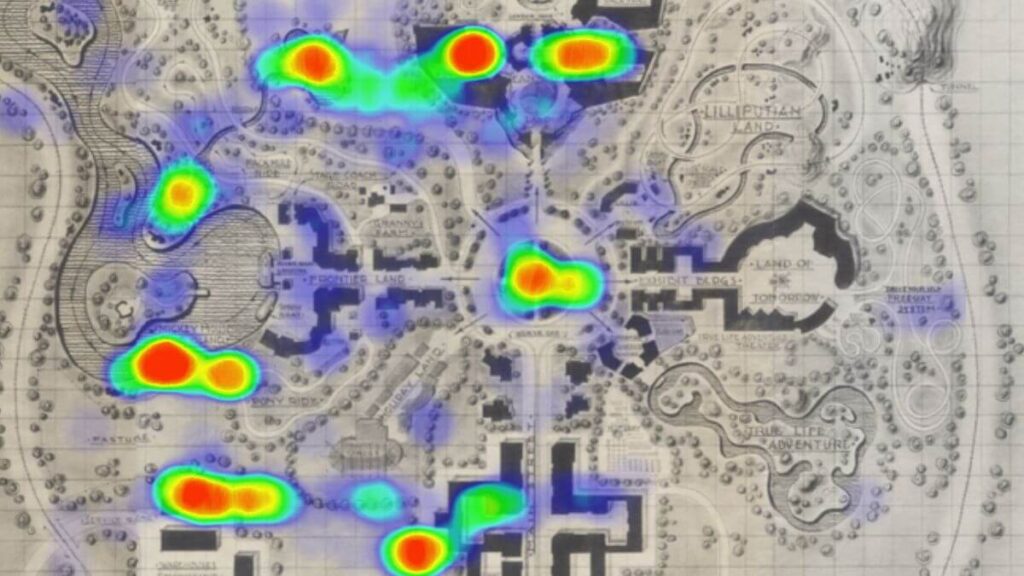
Heatmaps
Users scroll and click all over websites. In this digital age, everything is tracked and one of the more powerful ways to track user engagement is using a heatmap.
Popular heatmap tools can take a screenshot of your page and add a color overlay for different interactive actions. You can see how far someone scrolls down the page. You can even tell how hard a user clicked a button - sometimes called an "angry click".
Depending on your tool, you can even view the entire users website journey with a video heatmap. By watching how they interact with your content, you can make decisions on imagery, content layout, and where to place your call-to-action button.
Just like a worn out piece of grass, you can see the overall data to decide if you need to upgrade your layout for a better user experience.
Utilidoor
I'm sure you've heard about Walt Disney World having a giant underground tunnel system, right? This was all because of a cowboy and a space man.
Disneyland, the original park in Anaheim, does not have this full underground system. During the early days of Disneyland, Walt observed a cowboy from his Frontierland walking through Tomorrowland. This broke the entire theme and emersion. For this reason, when they were designing Walt Disney World they decided to make a tunnel system where workers can get to different parts of the park without having to break the theming.
Theme Consistency
Although we don't think of websites as themed lands, when users jump around with different colors, fonts, and styles - it's no different than a cowboy jumping on Space Mountain.
We might not think of it much, but the overall theming of a website helps tell the story of the brand. The use of color can highlight what's important. Using proper colors can also help set the tone and mood for your content. Jumping around using various colors that don't relate or compliment can be a strain on the eyes and cause subliminal discomfort.
The same can be said with fonts and typefaces. Websites are not the place to get super cute with fonts. Using more than two or three fonts is also not the best practice. Use a specific font for headings and an easy to read font for the body text.
Buttons, borders, and hovers - make them consistent. Don't round the corners of one button and then create a blocked look for another.
Keep the cowboys in Frontierland and the Astronauts in Tomorrowland.

Disneyland Will Never Be Completed
Walt's opening speech at Disneyland stated that his theme park would never be completed. He understood and was attracted to the fact that theme parks could change. Unlike his movies, once they were distributed, he wasn't able to go back and make edits. Theme parks, on the other hand, could evolve over time and you could always "plus" (as he said) attractions and lands.
That's why when I visited Disneyland in October, there wasn't a Peoplemover or even a Rocket Rods (two extinct attractions in Tomorrowland). Over time, Disneyland and Walt Disney World would tear down old attractions and bring in new. Even now, the iconic Splash Mountain is turning into an attraction featuring characters from the Princess and the Frog.
This constant change gives visitors a reason to come back to the parks and try new things.
Updating Content
Imagine if Disneyland looked the same as it did in 1955. What was impressive back then would certainly not be impressive today. The same can be said about your website.
Many businesses grow or evolve over time, yet they never think about updating the information on their website. Even if it's a yearly photoshoot, updating your website gives the user a better experience and a better understanding of your current offerings.
But beyond just updating your general pages, adding new content to your site gives users a reason to come back to your site.
The fact that the Magic Kingdom now has a Tron ride is a great reason for people to visit Walt Disney World. Not only will this attraction help generate new ticket sales, it adds credibility and excitement. The Magic Kingdom has ANOTHER thrill ride. This buzz circulates through the community and generates a positive impact that pays off in word-of-mouth.
Adding new blogs, videos, or resources to your website gives users a reason to come back and a reason for them to share on their favorite platforms. Adding this content allows you to gain authority with new customers and also search engines (that want to rank your website in their queries).
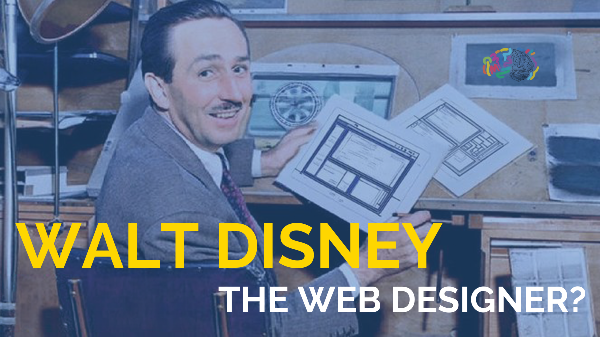
Did Walt Disney Build the Best Website?
Walt Disney died in 1966 - long before the internet and websites. Of course he never built a website, let alone the best website. But, Walt Disney would have made one heck of a web designer. His ability to understand user experience would have made him a wonderful UX designer. His ability to add more to his parks would have perfectly lended to him being a great content marketer - adding blogs and resources to websites. Walt Disney loved to see how things worked. He would have been on the cutting edge of development.
Although Walt Disney did not create a website, his design of Disneyland is a perfect example of art and science - which is why Walt would have made an amazing website.